Yellowbird Learning
A Kajabi Web Design Case Study

Rina Simon
Owner, Yellowbird Learning
Rina is a reading interventionist who diagnoses and treats dyslexia in elementary school children. Her company, Yellowbird Learning, provides online dyslexia evaluations and courses that help parents of dyslexic children navigate common struggles with reading.
Here’s what she said when she reached out to me:
“Right now I only have a landing page, but I want to set up a full website with an online course. I have all the copy written for my website, a logo, and fonts. I need help putting it all up so it looks nice and is functional.”
project overview
- Website Branding
- Custom Kajabi Website
- Sales Funnel Creation
- Course Setup and Customization
- Foundational SEO
- Website Training Videos
project goals
Rina’s business had a lot of moving pieces. She was selling a paid virtual dyslexia assessment and an online course on reading. Along with that, she had a free masterclass and free checklist that acted as lead magnets. In short, we needed a lot of different pages beyond just the main website.
The main focus of the project was to create a cohesive on-brand feel for the entire site while guiding visitors on a seamless journey through Rina’s offerings.
inspiration & branding
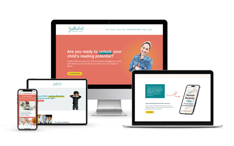
When we talked about design inspiration, Rina mentioned the legendary Amy Porterfield multiple times, specifically her Desk Job to Dream Job opt-in page. It’s a short page, but the vibes are on point, which is what I wanted for Rina’s website. So I focused on keeping things bright and colorful, and worked in some fun elements like hand-drawn arrows and hand-written call-outs. I know the topic of dyslexia can feel really overwhelming for parents, so I wanted to keep the site cheerful.
While Rina had a professionally-created logo and fonts, the branding stopped there. I was able to pull some elements from her logo for the website, like the sweet and subtle bird background you can find repeated on multiple pages. I utilized playful hand-drawn elements to draw visitors’ eyes around the page, while sporadic pops of yellow made the CTA buttons really stand out.

customer journey
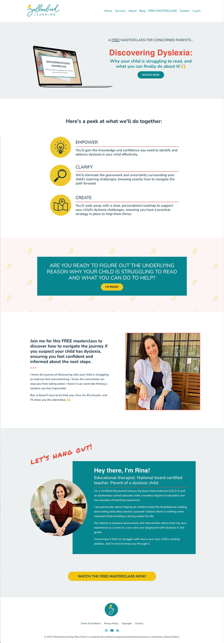
With Rina’s new website, visitors are gently guided from cold lead to customer. I used lots of arrows and call-out sections to direct people to find the help they need, whether its determining if their child might be dyslexic, or getting their dyslexic child the help they need to excel in reading and school. Cold leads are led through lead magnets and onto the email list, while warm leads are gently guided to purchase Rina’s course or apply for an assessment.
We kept the majority of the imagery on Rina’s website positive, showing children reading on their own or with a parent or caregiver. There’s plenty of fear and uncertainty when you’re dealing with a potential dyslexia diagnosis, and I wanted Rina to be seen as a safe and uplifting guide through it all.

“I would highly recommend hiring Kelly. She has a strong talent for creating polished, effective websites. Communication was efficient, and she was incredibly responsive to feedback, making adjustments quickly and accurately. The final product exceeded my expectations. Overall, it was a great experience.”
Rina Simon
Owner, Yellowbird Learning

homepage

masterclass

about

